A CRM landing page designed to turn product complexity into clarity.
Design Challenge Newform challenged participants to design a landing page for a CRM dashboard. I approached Arcane as a product-led marketing experience, focusing on communicating the value of the platform while giving the dashboard itself enough visual presence to make the product tangible.
- Role
- UI/UX Designer & Frontend Developer
- Scope
- UX Design · UI Design · Design System · Responsive Development
- Tools


- View Live Project

Make the product the story.
The direction was built around strong visual hierarchy and product storytelling. Rather than relying heavily on marketing copy, I used the CRM interface as a key part of the narrative, showing visitors what the product looks like and how the experience comes together.
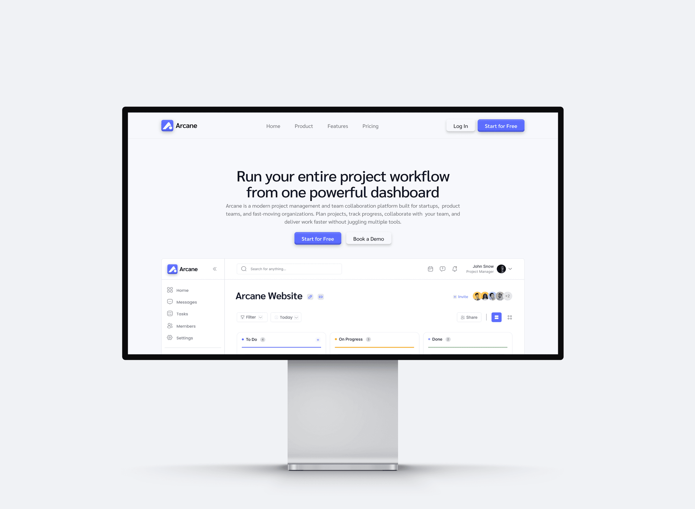
Designed to feel like a product, not just a landing page.
I focused on creating a polished SaaS aesthetic while keeping the interface easy to scan. Product screenshots, structured content blocks, typography, and spacing work together to give the page a sense of depth and make the CRM feel like a real product rather than an abstract concept.
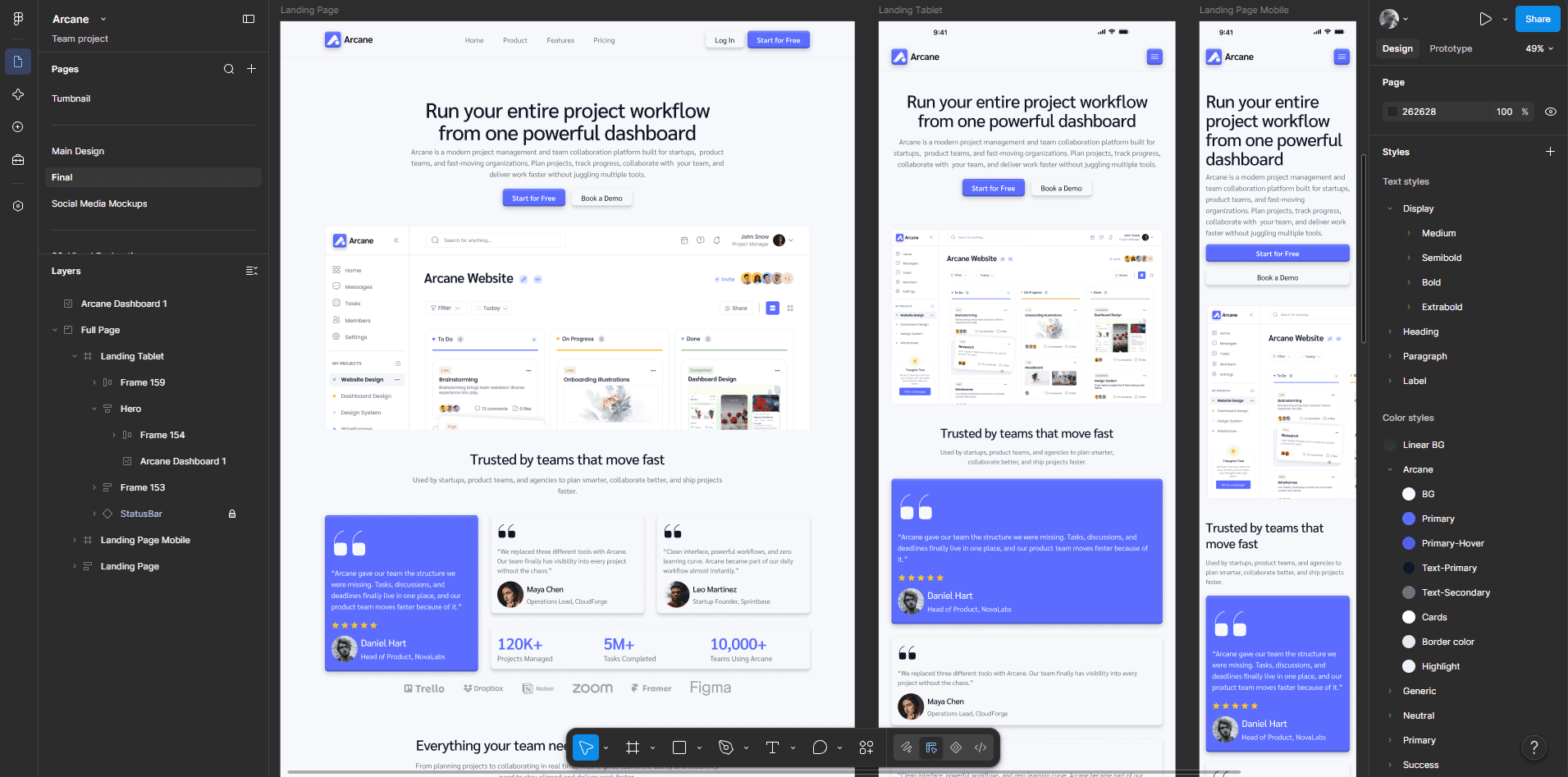
A good SaaS landing page should sell the product by showing it.
Arcane reinforced my interest in product-led web design, where the website doesn't just explain the software. It gives people a reason to want to use it.
More projects worth exploring.
A selection of other projects across web design, product design, and development.