01
Usability
Dense, flat layouts
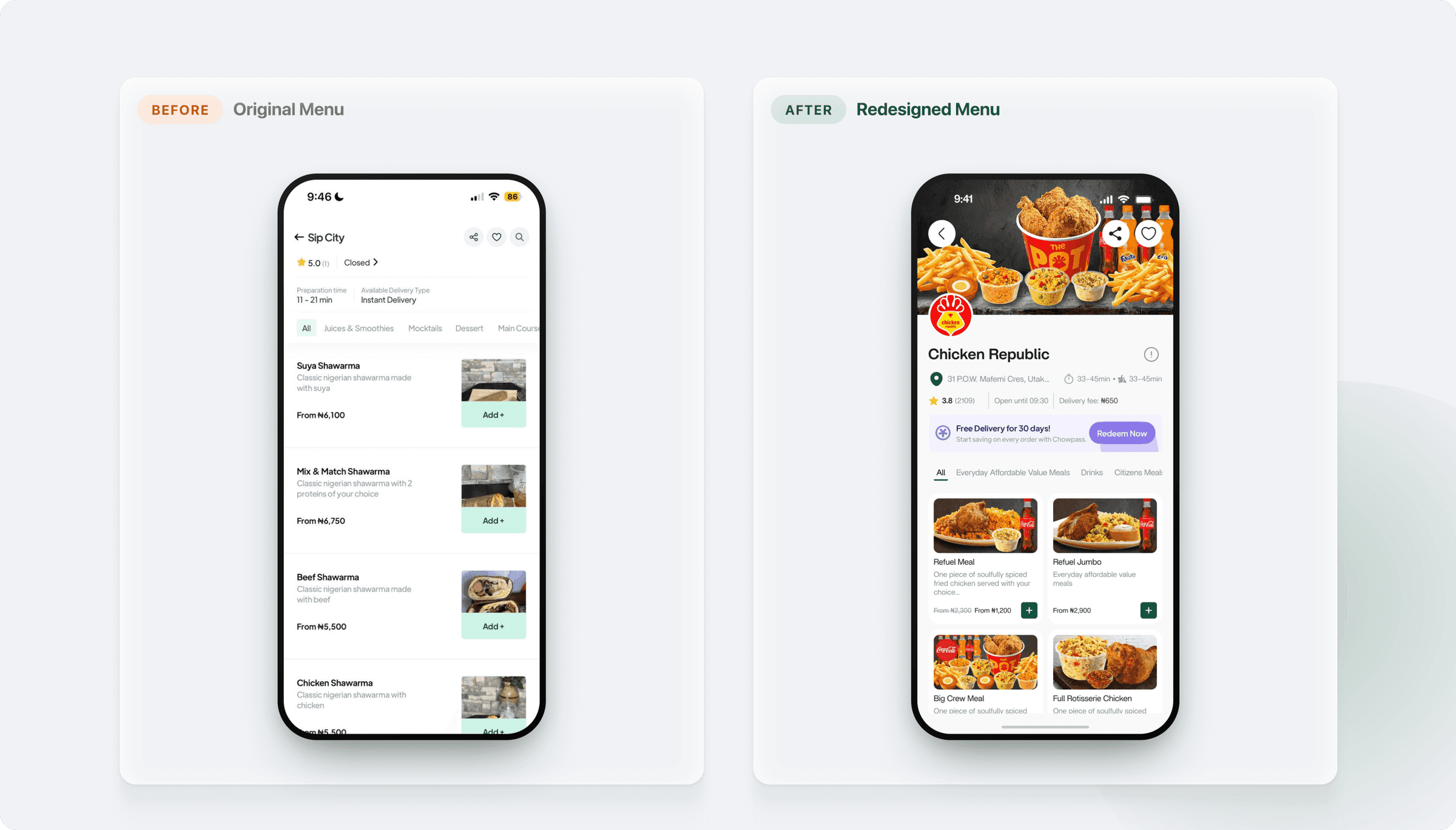
Menus and lists relied on long text rows with little imagery, making it hard to scan and compare meals at a glance.

Chowdeck connects people to restaurants, shops, and pharmacies across Nigeria. This self-initiated redesign explores how the familiar Chowdeck experience could feel more modern and effortless while keeping the brand, speed, and warmth users already recognise. The challenge was simple: the ordering flow worked, but small frictions added up. I redesigned the experience around clearer hierarchy, better discovery, stronger visual consistency, and a more confident path from finding a meal to placing an order.

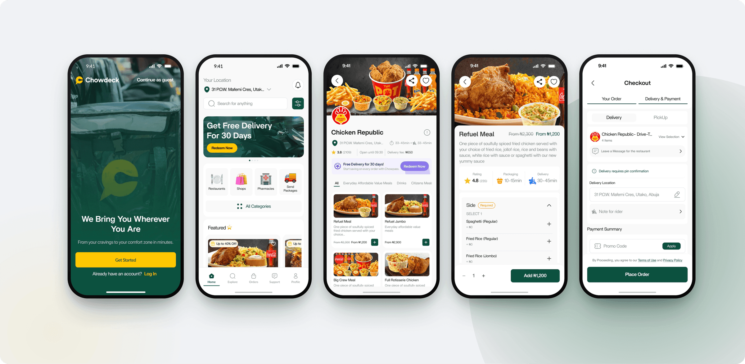
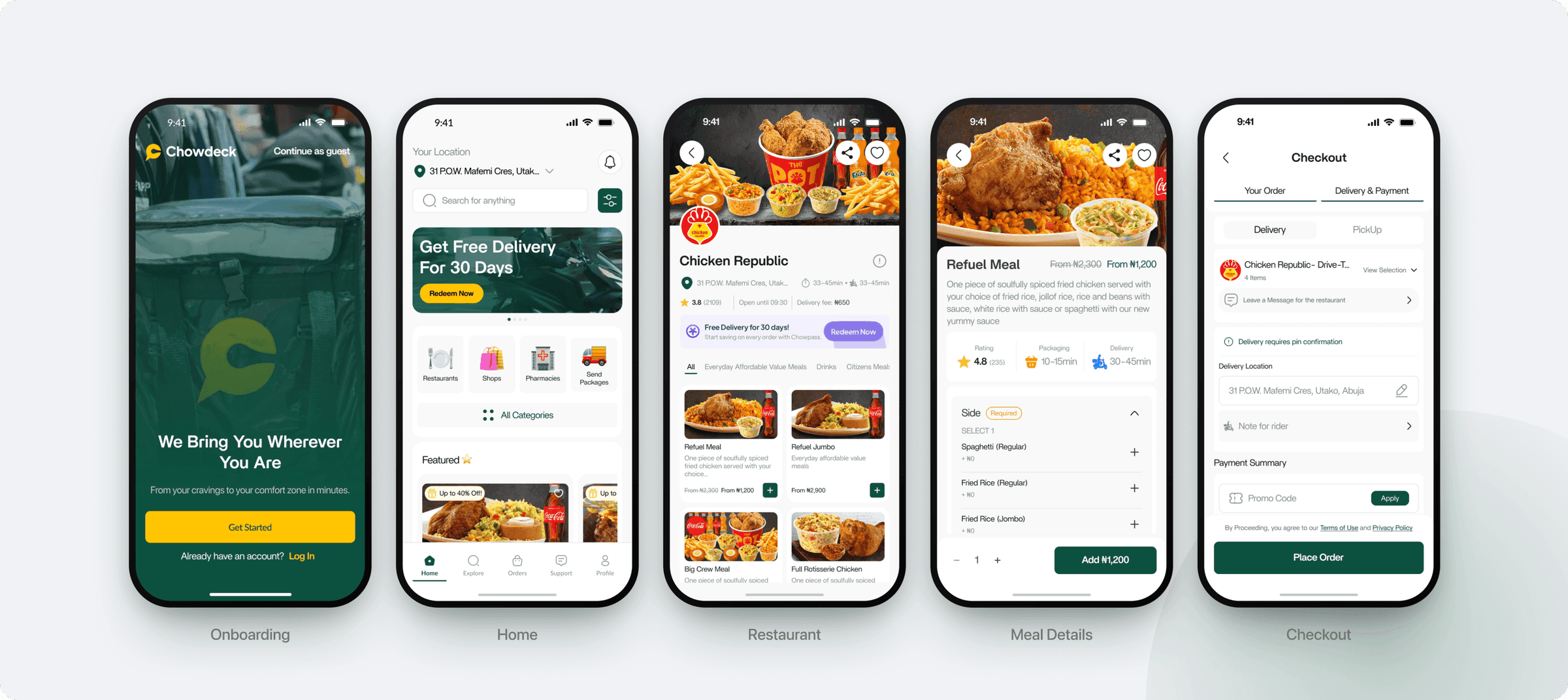
Five screens cover the full ordering journey, from first open to placed order. Nothing moved for the sake of it: every change had to earn its place by making the next step clearer or the whole thing quicker.
Studying the current app surfaced four recurring friction points that slowed people down and quietly chipped away at confidence while ordering.
Dense, flat layouts
Menus and lists relied on long text rows with little imagery, making it hard to scan and compare meals at a glance.
Buried discovery
With no persistent search on the home screen and a cramped category grid, finding restaurants and meals took more effort than it should.
Mixed visual language
Spacing, type weight and button styles drifted between screens, weakening the premium feel of the brand.
Low-confidence checkout
Pricing, fees and progress were not always clear, leaving users unsure before committing to an order.

Make every core task obvious, tappable and quick to complete.

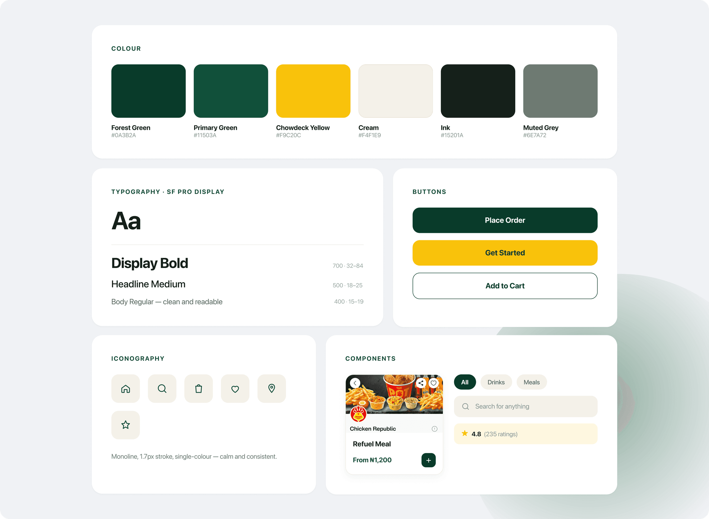
Guide the eye with an intentional type scale, spacing and grouping.

Refresh the UI with cleaner cards, real food imagery and rhythm.

Surface ratings, pricing and progress so ordering feels safe.

Make restaurants and meals easy to find, filter and browse.

Preserve the recognisable Chowdeck green, yellow and warmth.
Strip out the noise. Give each screen a single clear job and room to breathe.
Shorten the path from craving to checkout with persistent actions.
Let imagery and price lead. Supporting detail steps back.
Consistent buttons, sheets and feedback across the whole flow.
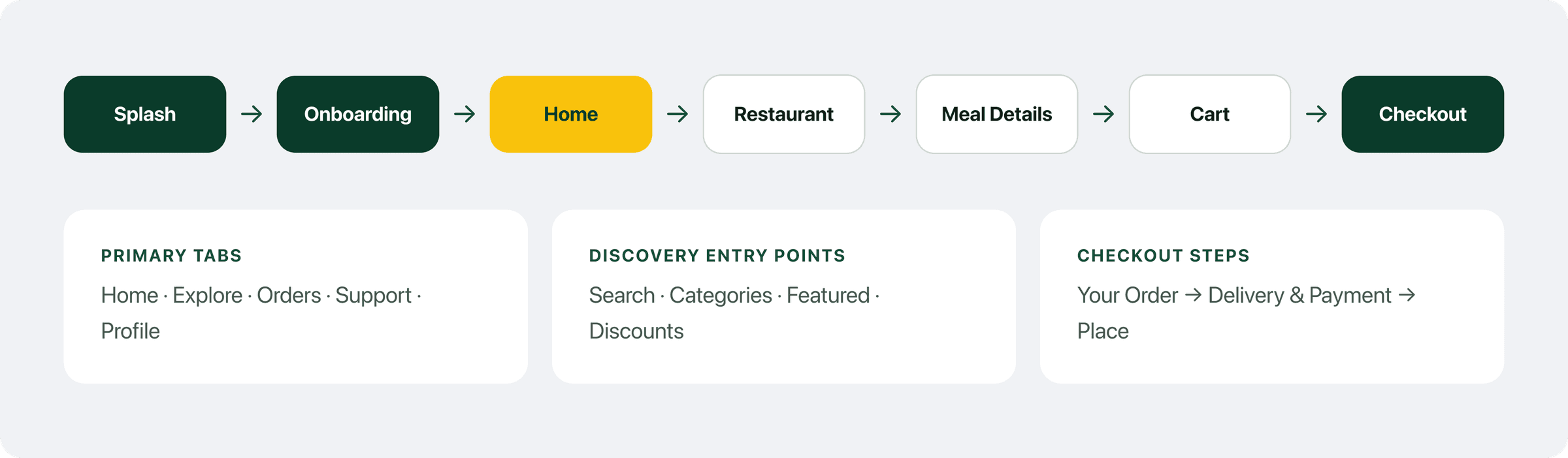
Mapping the journey kept the structure honest. Every screen earns its place between launch and a placed order.
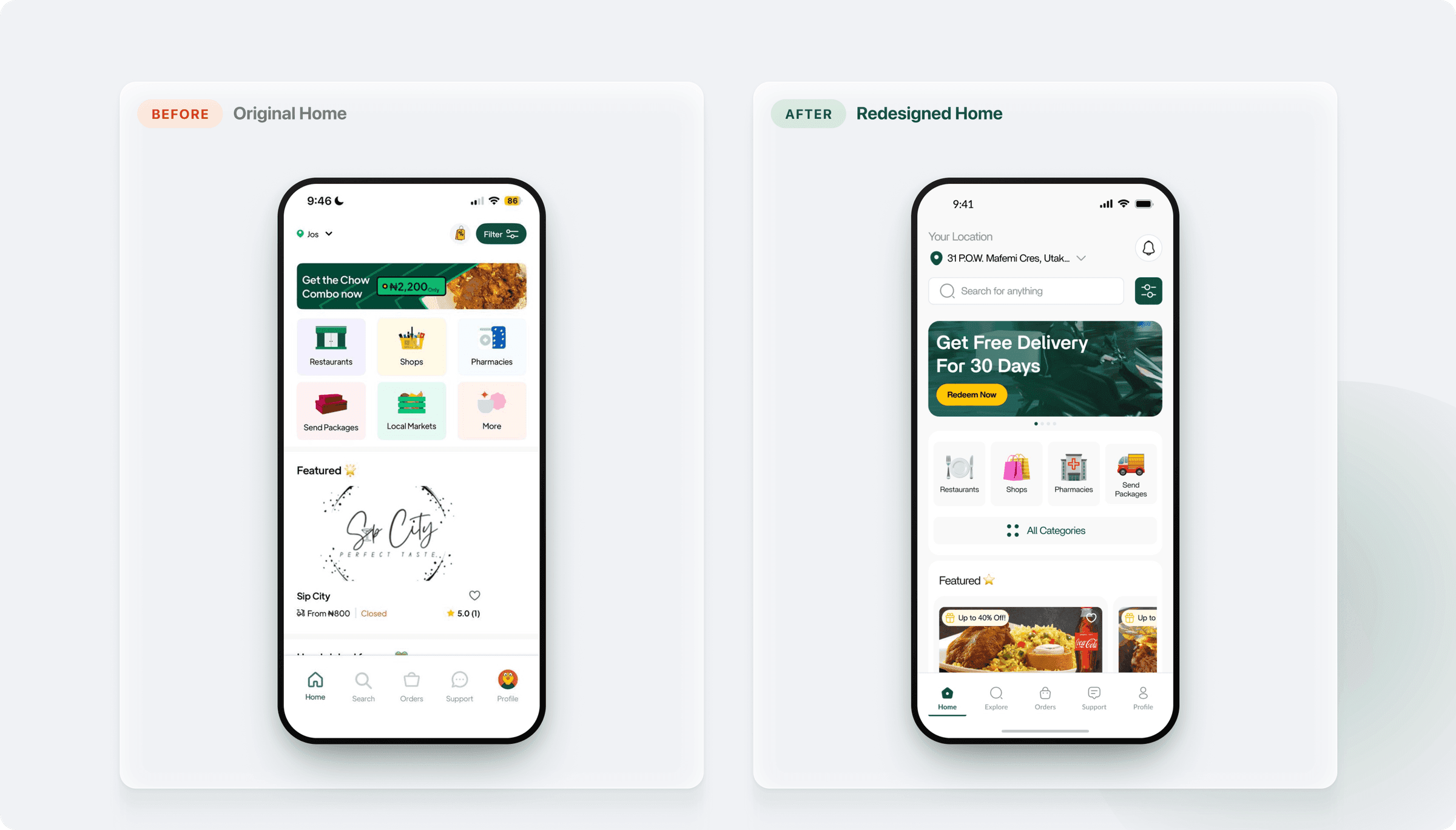
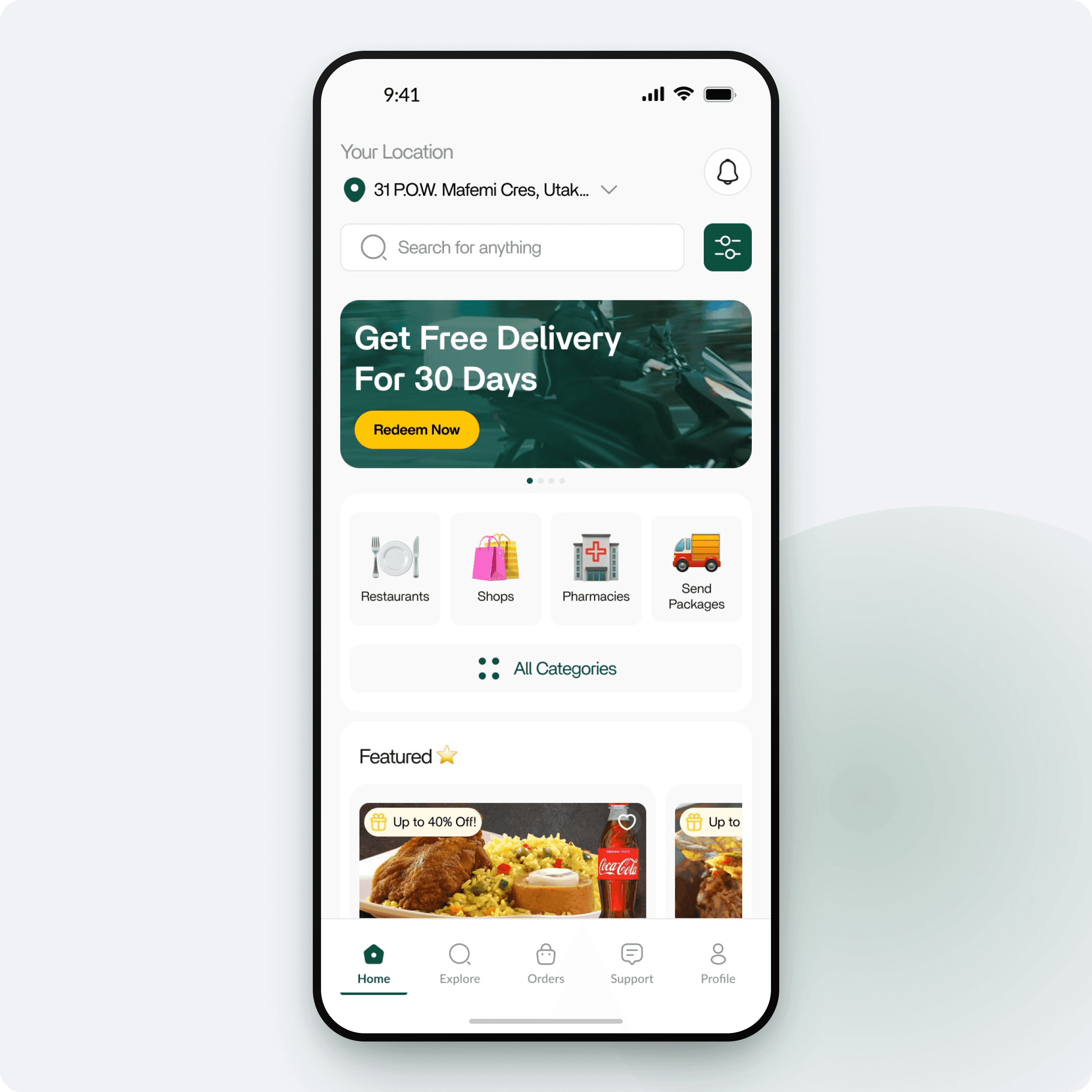
The new home leads with location, search and a promo carousel, followed by tidy category tiles, so the next tap is always obvious.

Discovery is one tap away from the moment you land.
"Your Location" labelling removes any ambiguity.
Offers and categories sit in a clean, scannable rhythm.
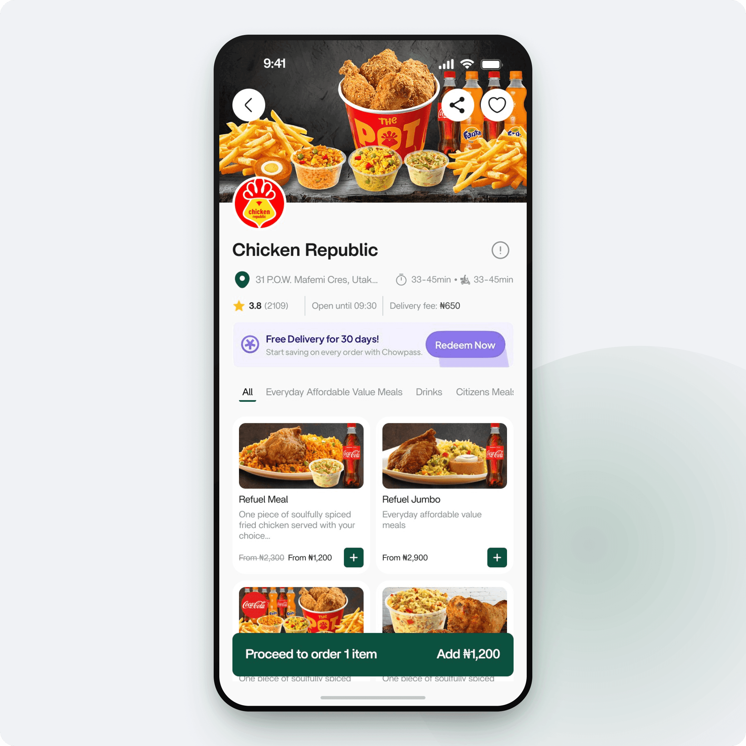
The restaurant view now leads with rich imagery, a clear info bar and a two-column menu grid, so comparing meals takes seconds instead of scrolling.
2-col
Visual menu grid
★ 3.8
Rating, hours & fees up top
Quick-add
Add without leaving the list
Sticky bar
Persistent “proceed to order”
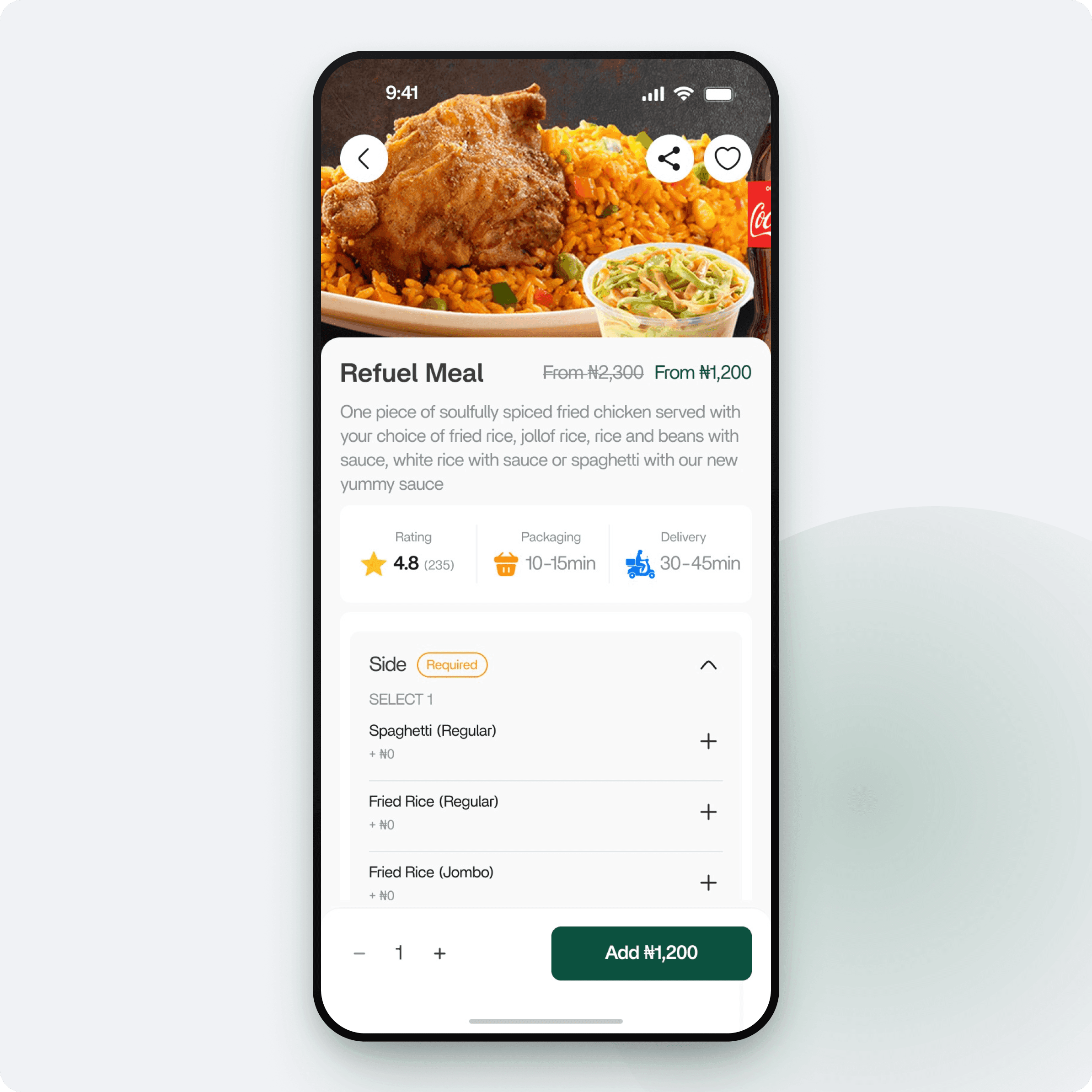
A full-bleed dish photo, an at-a-glance info row and a clearly marked required selection make customising and adding a meal feel confident and quick.
Rating
★ 4.8
Packaging
10–15 min
Delivery
30–45 min
Modifier groups now make mandatory choices unmissable.
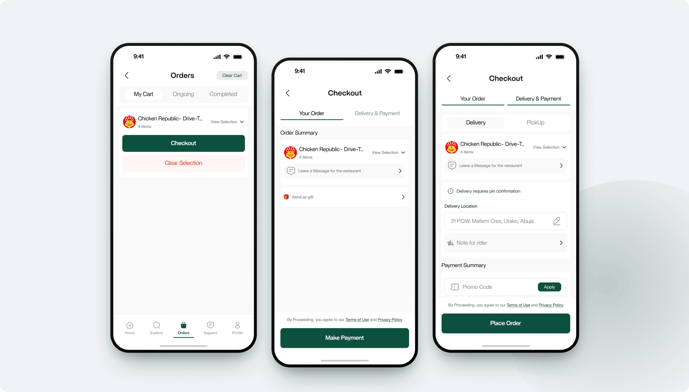
A tabbed cart hub and a two-step checkout (Your Order, then Delivery & Payment) keep people oriented all the way to "Place Order".
Onboarding · Home · Restaurant · Meal Details · Checkout
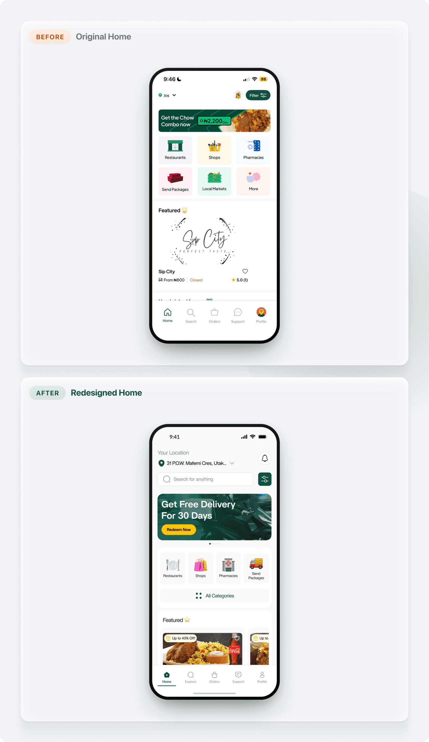
Added persistent search
Discovery surfaced on home instead of hidden in a tab.
Promo carousel
Rotating offers with clear pagination replace a static banner.
Calmer categories
Lighter tiles and an “All Categories” entry reduce clutter.
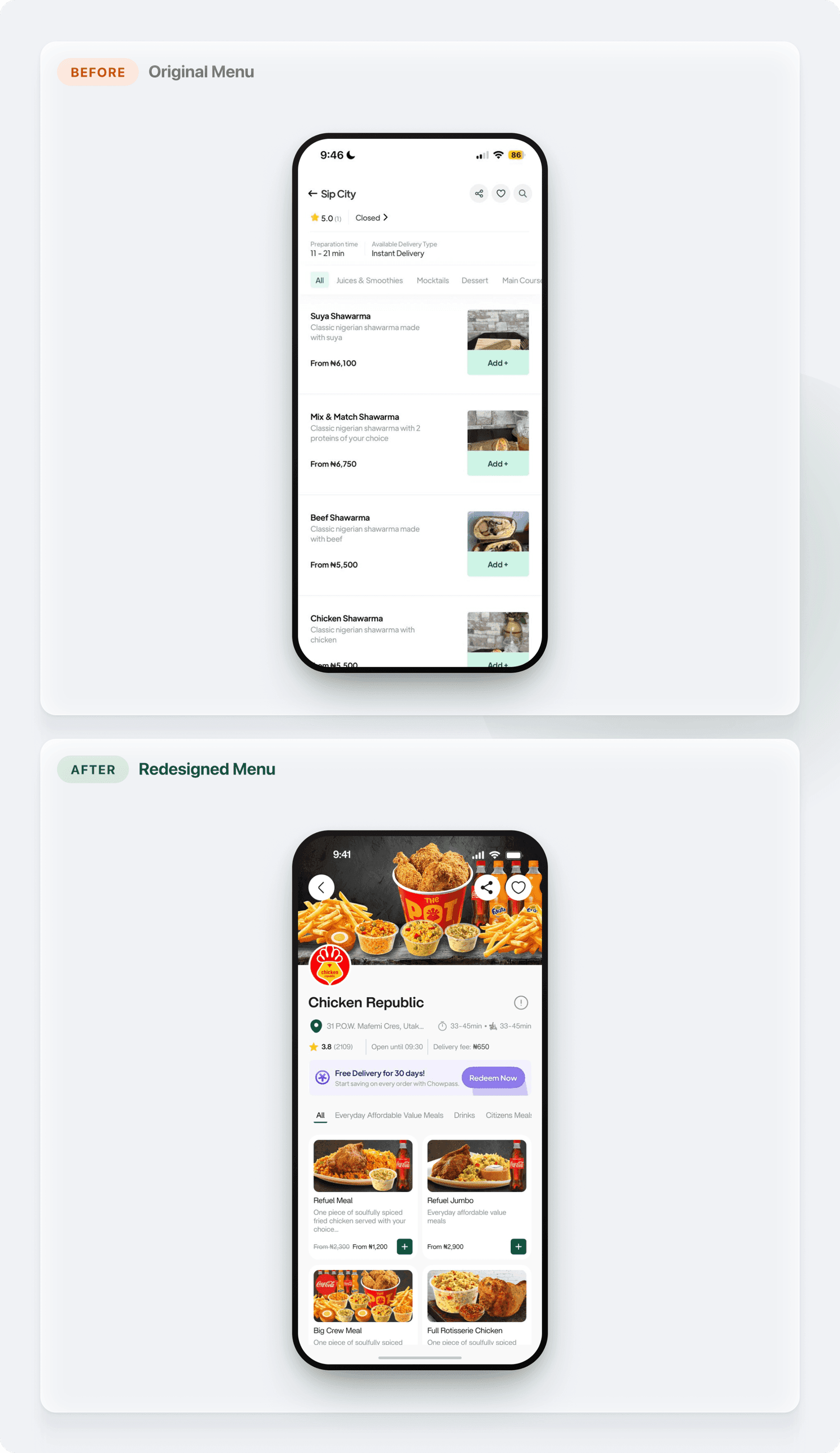
Text rows to photo grid
A visual two-column grid replaces dense single-line items.
Trust info up top
Rating, hours and delivery fee are visible before browsing.
Persistent order bar
A sticky "proceed" bar keeps checkout one tap away.
By sharpening hierarchy, modernising the UI and reducing friction at every step, all while protecting the brand people already trust, the redesign makes Chowdeck feel faster, clearer and more enjoyable to use.
2-step
Streamlined checkout
1 tap
To search and discover
7
Screens redesigned
100%
On-brand identity kept
A selection of other projects across web design, product design, and development.