Turning a complex insurance technology ecosystem into a clearer digital experience.
RedPear is an insurance technology company helping organizations modernize operations through AI, digital transformation, customer engagement, and insurance platforms. The challenge was simple: the business was complex, but the website didn't need to be. I redesigned the experience around a clearer journey that helps visitors understand what RedPear does, see how it works, build confidence, and ultimately take action.
- Role
- UI/UX Designer & Frontend Developer
- Scope
- Website design · UX Strategy · Information Architecture · UI Design · Frontend Development
- Tools


- Project
- B2B · Insurance Technology
- View Live Project

Lead with the one thing that matters.
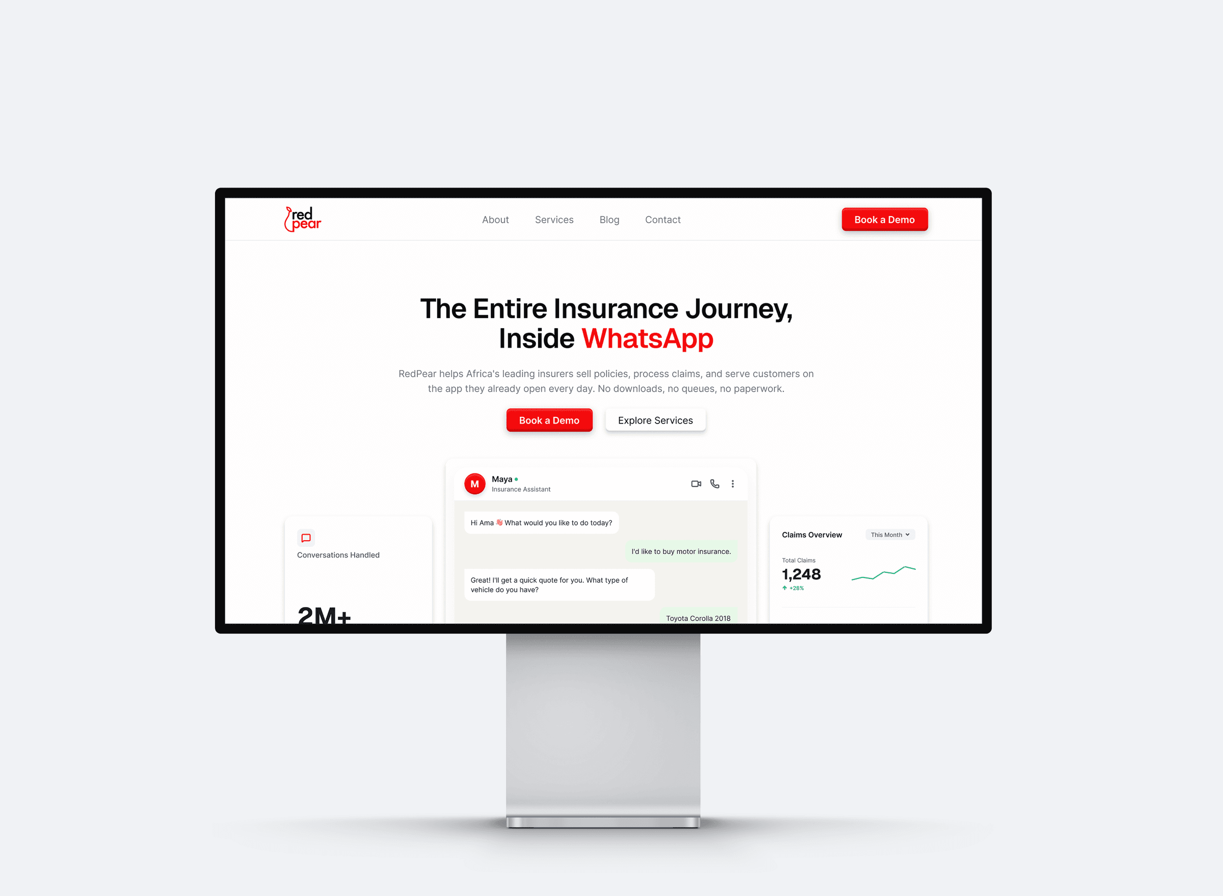
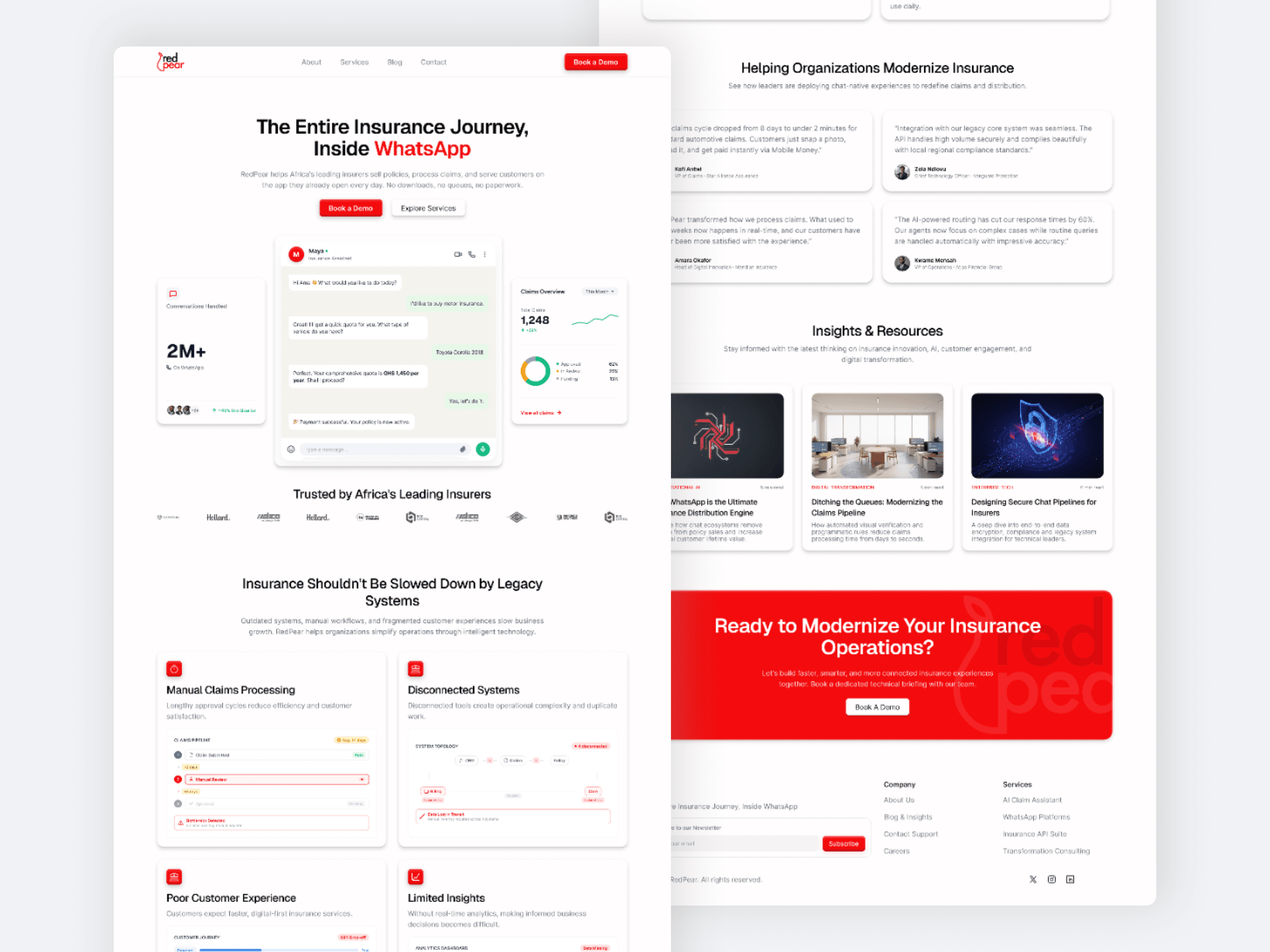
The homepage opens on a single claim — the entire insurance journey, inside WhatsApp — with a demo request and a route into the services sitting directly beneath it. Everything further down the page is there to support that claim rather than compete with it.
The business was complex. The experience didn’t need to be.
Insurance technology involves systems, claims, customer engagement, analytics, AI, and enterprise infrastructure. Presenting these as disconnected capabilities can make the experience difficult to navigate and even harder to understand.
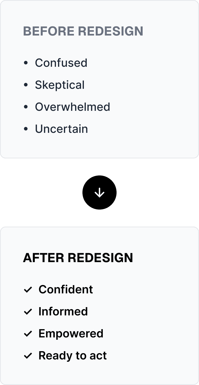

The key questions became: What does RedPear do? How does it help me? Why should I trust it?
From complexity to clarity.
RedPear had a lot to communicate. I needed to create a structure that could organize that complexity without overwhelming the visitor. The sitemap became the foundation for that structure, grouping the experience around the questions a potential customer would naturally have.
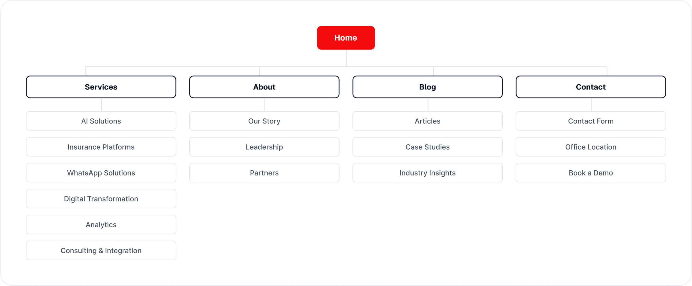
What does RedPear do? → What solutions do they offer? → Who are they for? → Why should I trust them? → How do I take the next step?
Show the technology. Don’t just talk about it.
Instead of relying heavily on marketing copy, the experience gives the products room to speak for themselves. Product interfaces, workflows, dashboards, and AI interactions become part of the storytelling.
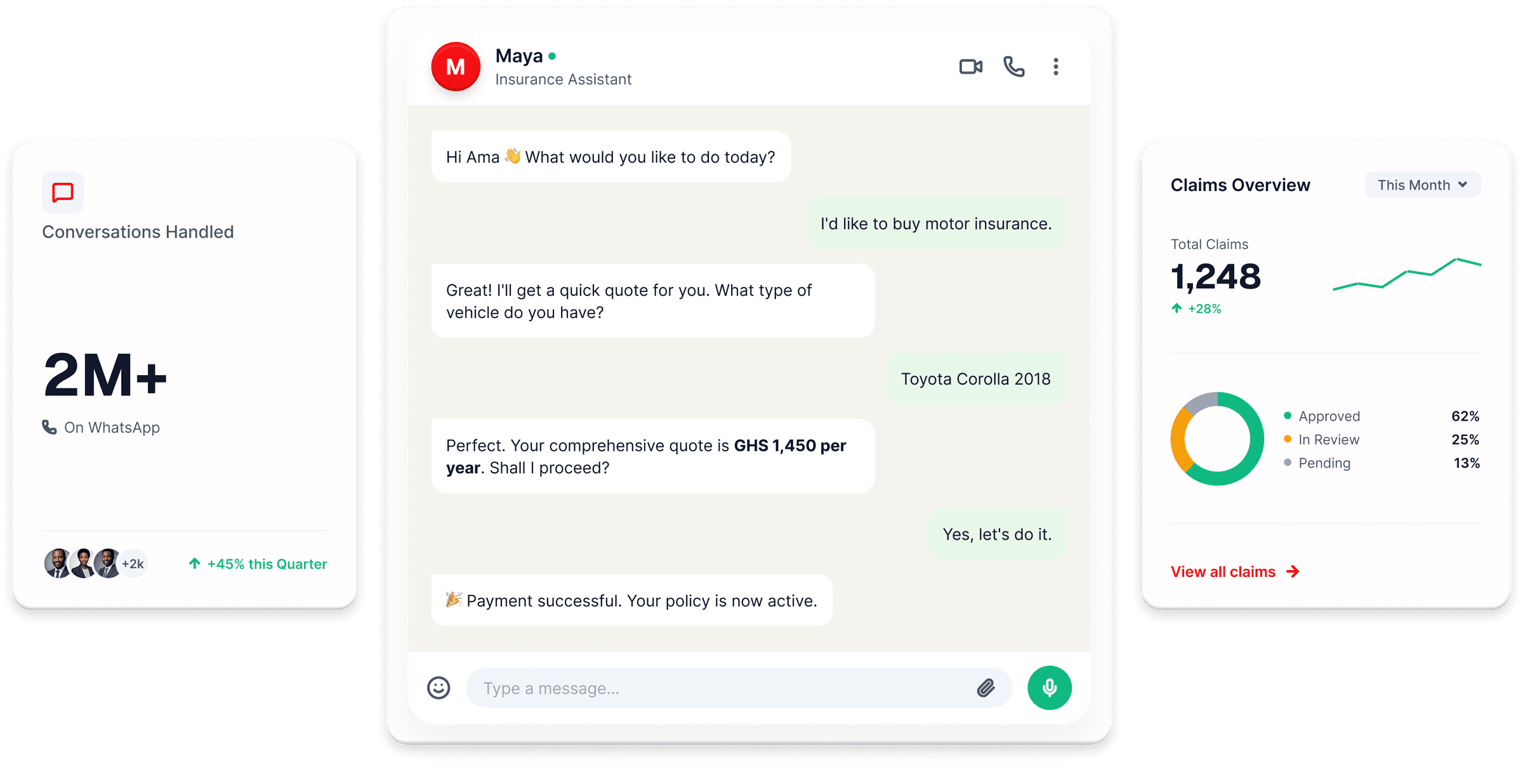
Maya, RedPear’s AI experience, becomes one of the clearest examples of this approach: See it → Understand it → Imagine using it.
One ecosystem. A clearer way through it.
The solutions section turns a broad product ecosystem into something easier to scan and understand. Instead of presenting every capability with equal weight, the information is grouped into clear categories that help visitors quickly identify what is relevant to them.
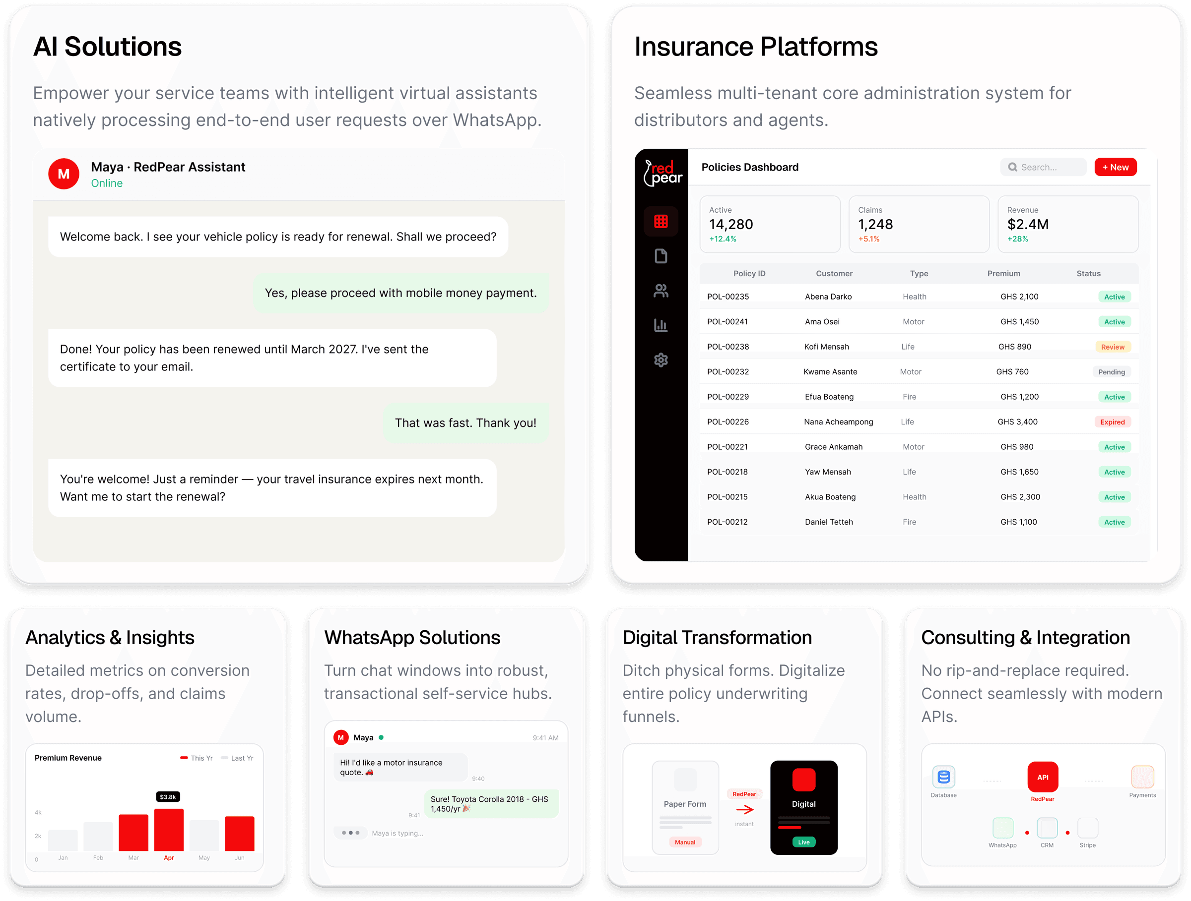
Explore → Find relevance → Dive deeper.
I didn’t stop at the Figma file.
I handled the project from strategy through implementation. This meant the final experience wasn’t just designed to look good in Figma. It was designed with the realities of the browser, reusable components, responsiveness, and interaction in mind.
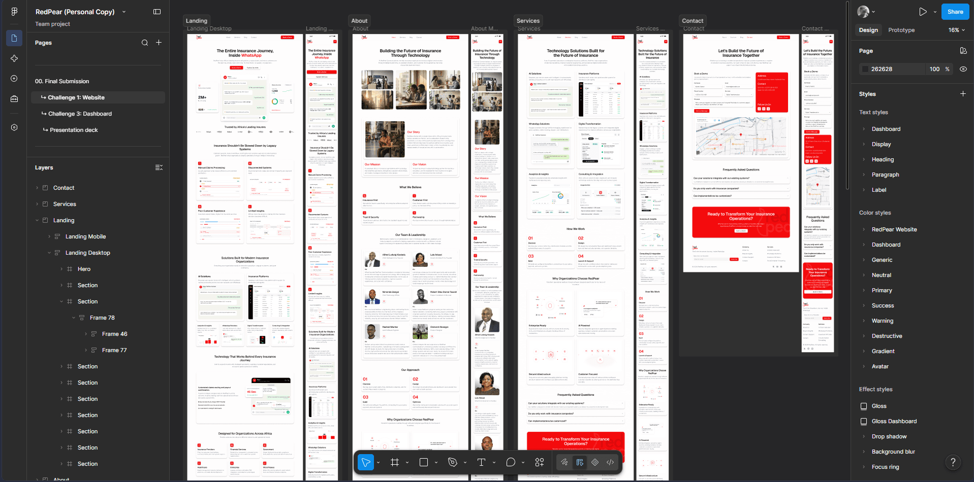
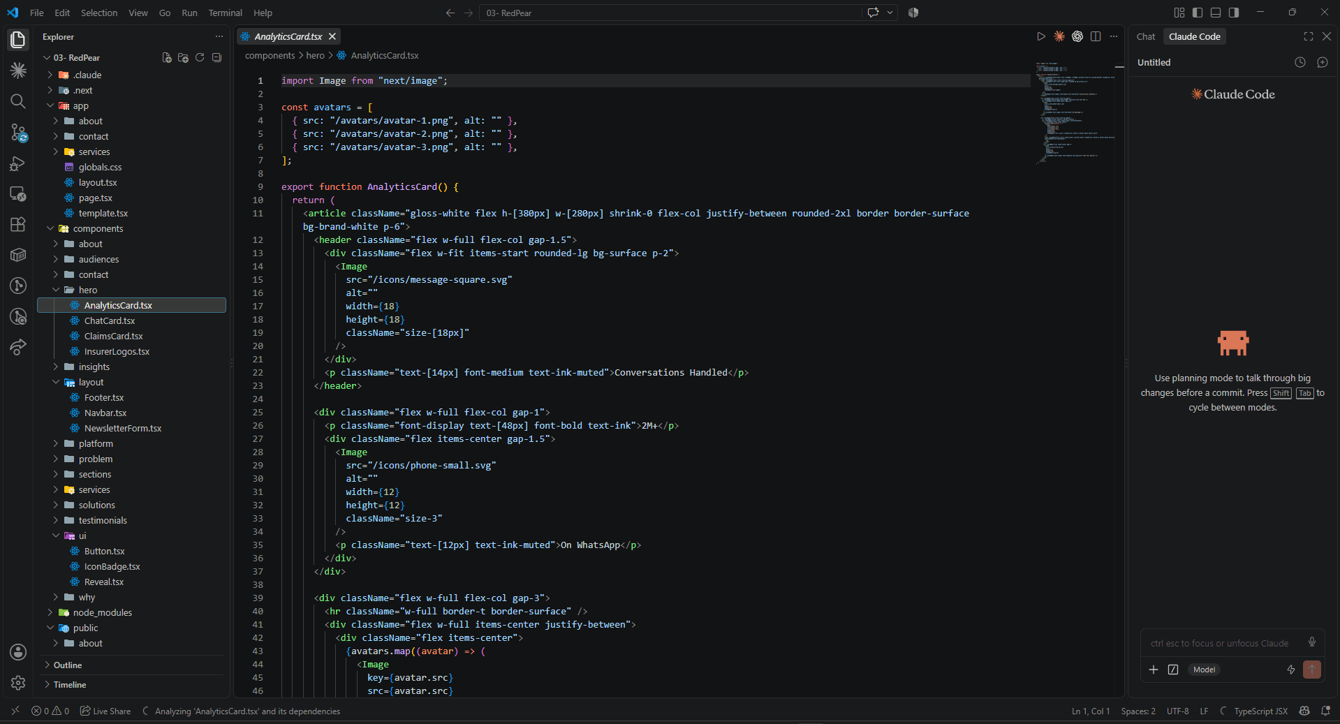
The process moved from Strategy → Information Architecture → Wireframes → Visual Design → Component Architecture → Next.js + TypeScript → Refinement.
A clearer path through a complex product ecosystem.
The redesign gives RedPear a more structured way to communicate what it does, demonstrate its technology, establish enterprise credibility, and move visitors toward action. The biggest shift was not adding more information. It was organizing the information so the right things become clear at the right time.
Complexity → Clarity → Confidence → Action.
The business can be complex. The experience shouldn’t be.
This project reinforced something I try to bring into every enterprise product: good design isn’t about making complexity disappear. It’s about giving people a clear way through it.
More projects worth exploring.
A selection of other projects across web design, product design, and development.