Making a startup landing page feel more human.
Creator Brand Hub is a startup platform with a landing page that I saw an opportunity to rethink. I came across the founder sharing a redesign of the website and decided to explore a different direction on my own. There was no formal discovery phase. I designed the first version, built it in Framer, and pitched it directly to the founder.
- Role
- UI/UX Designer & Frontend Developer
- Scope
- Landing Page Design · UI Design · Frontend Development
- Tools


- View Live Project

It started with a concept.
The first version was designed as a self-initiated pitch. The goal was simple: create a stronger visual direction for the landing page and bring the idea to life as a working website rather than just a Figma concept.
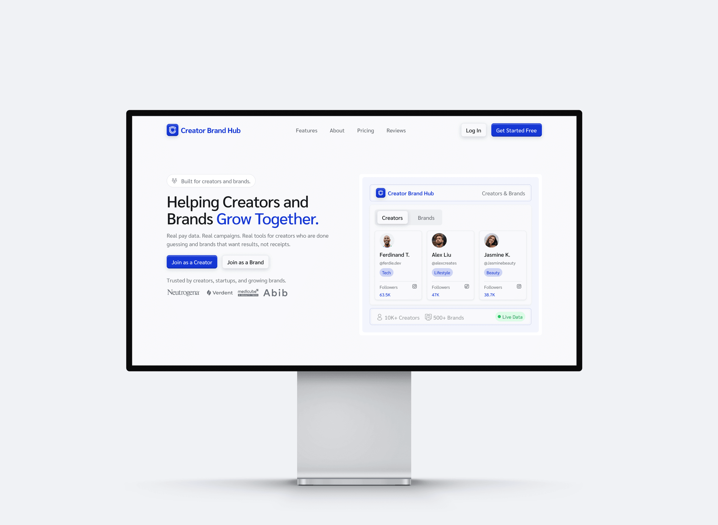
Idea → Design → Framer → Pitch
“Make it feel more human.”
The founder liked the direction enough to jump on a call, but there was one important piece of feedback: the design needed to feel more human. That became the turning point for the project. Instead of simply polishing V1, we explored a warmer direction that felt more personal and approachable while keeping the product clear.
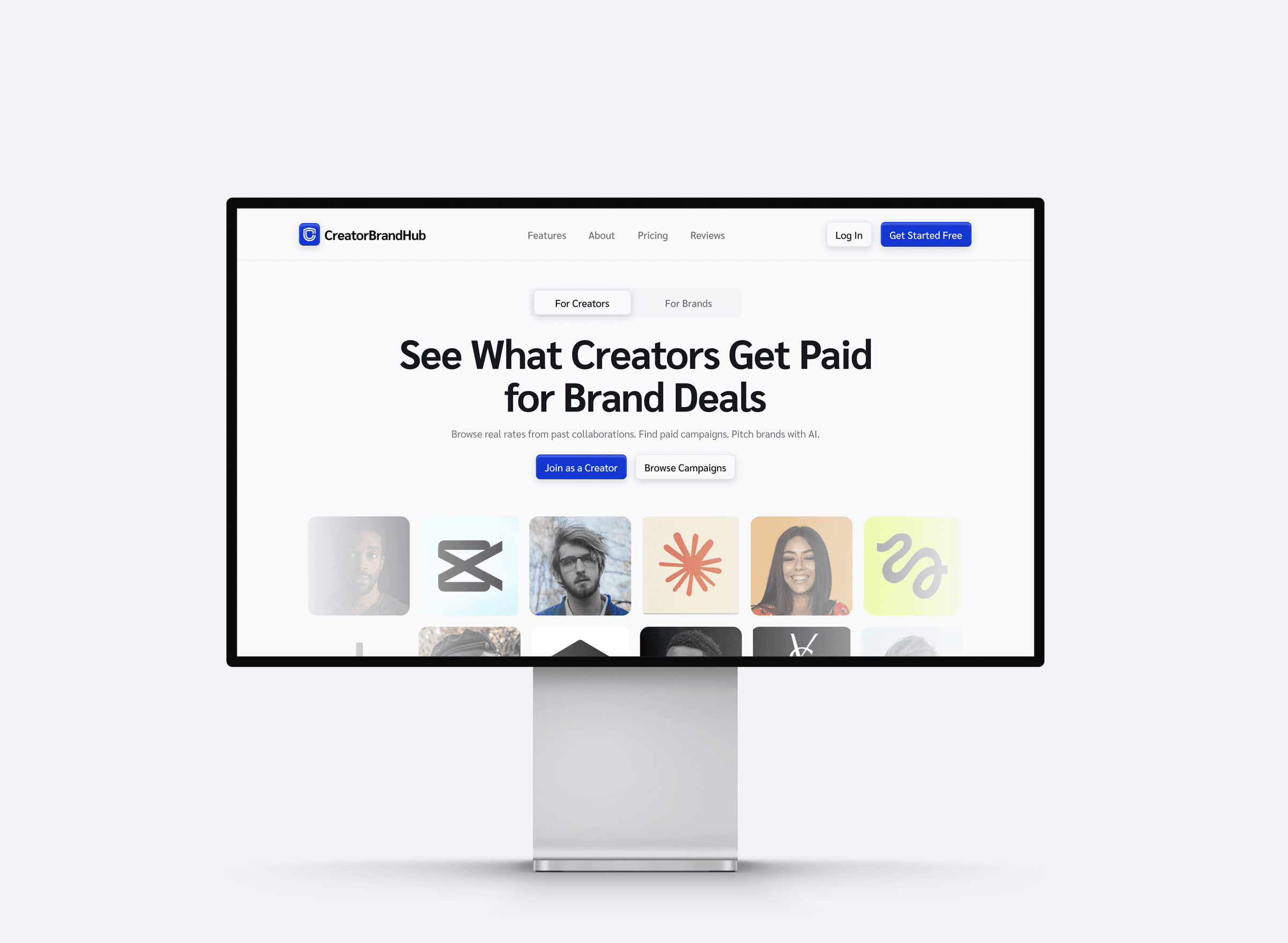
Iterating toward the final experience.
From V2, we continued refining the design and eventually introduced dark mode. The goal wasn’t to reinvent the page again, but to carry the stronger direction through the details and make the experience feel complete.
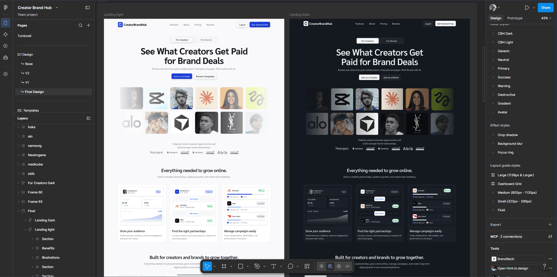
V1 → Human direction → Refinement → Dark mode → Final
From Framer to the product’s codebase.
I initially built the landing page in Framer because it was the fastest way to turn the concept into something real and pitchable. Later, we decided to move the implementation to Next.js because the platform itself was already running on that codebase. Keeping the landing page within the same stack made more sense than maintaining a separate implementation. I rebuilt the experience in Next.js and delivered the completed codebase through GitHub.
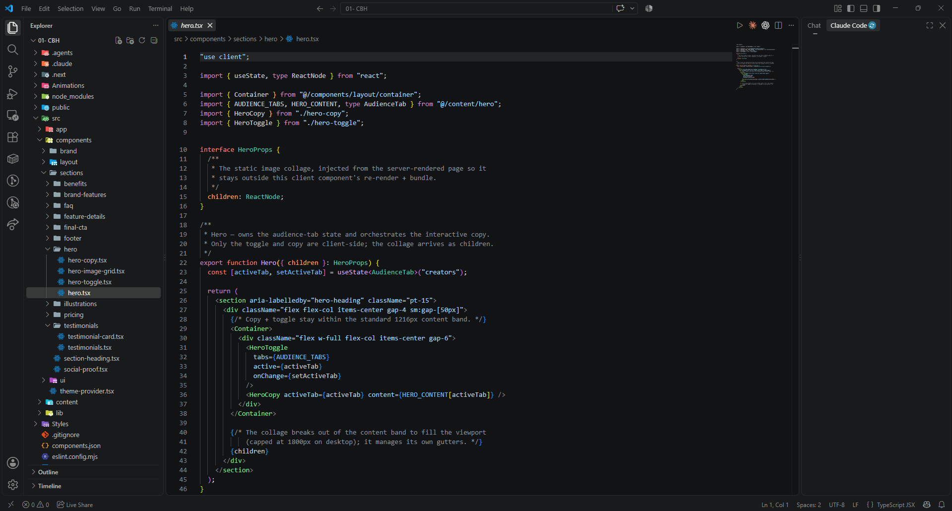
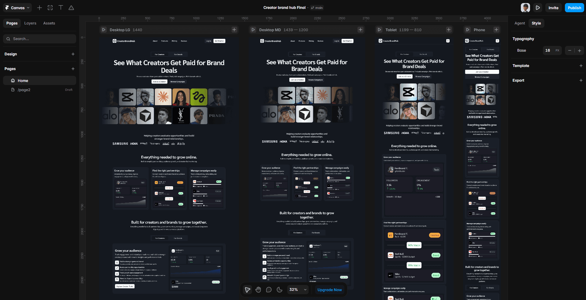
Framer → Existing Next.js codebase → Rebuild → GitHub
A pitch turned into a real build.
This project started with me seeing an opportunity and making something without being asked. One design pitch turned into a collaboration, and the strongest part of the process came from being able to respond to real feedback and carry the work all the way into production.
More projects worth exploring.
A selection of other projects across web design, product design, and development.