An insurance dashboard built for speed and clarity.
Surebase was the second RedPear design challenge, focused on creating a responsive admin dashboard for insurance teams. The goal was to bring policy, claims, and customer management into one interface while keeping complex operational data easy to scan and act on.
- Role
- UI/UX Designer & Frontend Developer
- Scope
- UX Design · UI Design · Design System · Responsive Development
- Tools


- View Live Project


Insurance operations shouldn’t feel complicated.
The brief called for a dashboard that could centralize policies, claims, and customer information while supporting the day-to-day work of insurance administrators. I focused on three priorities: speed, clarity, and scalability.
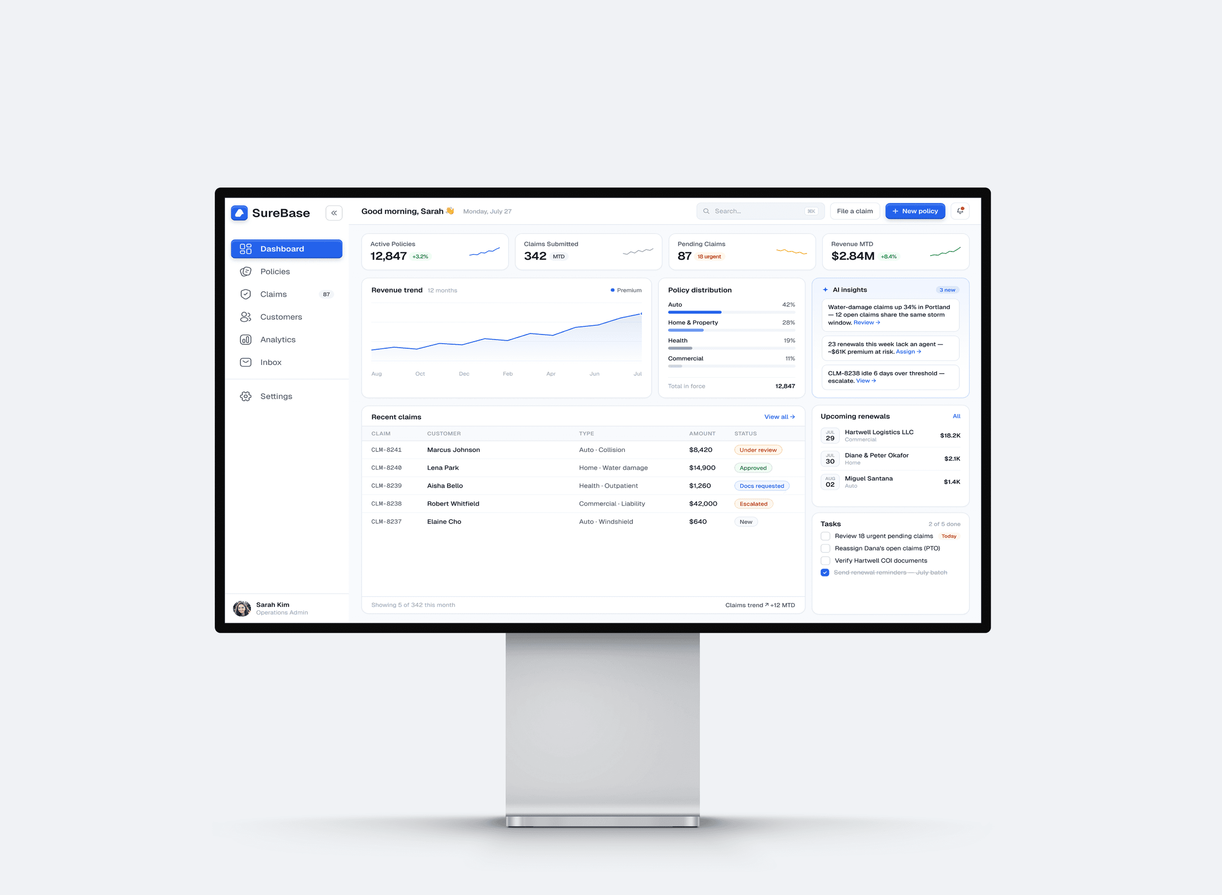
Designing around the work that matters.
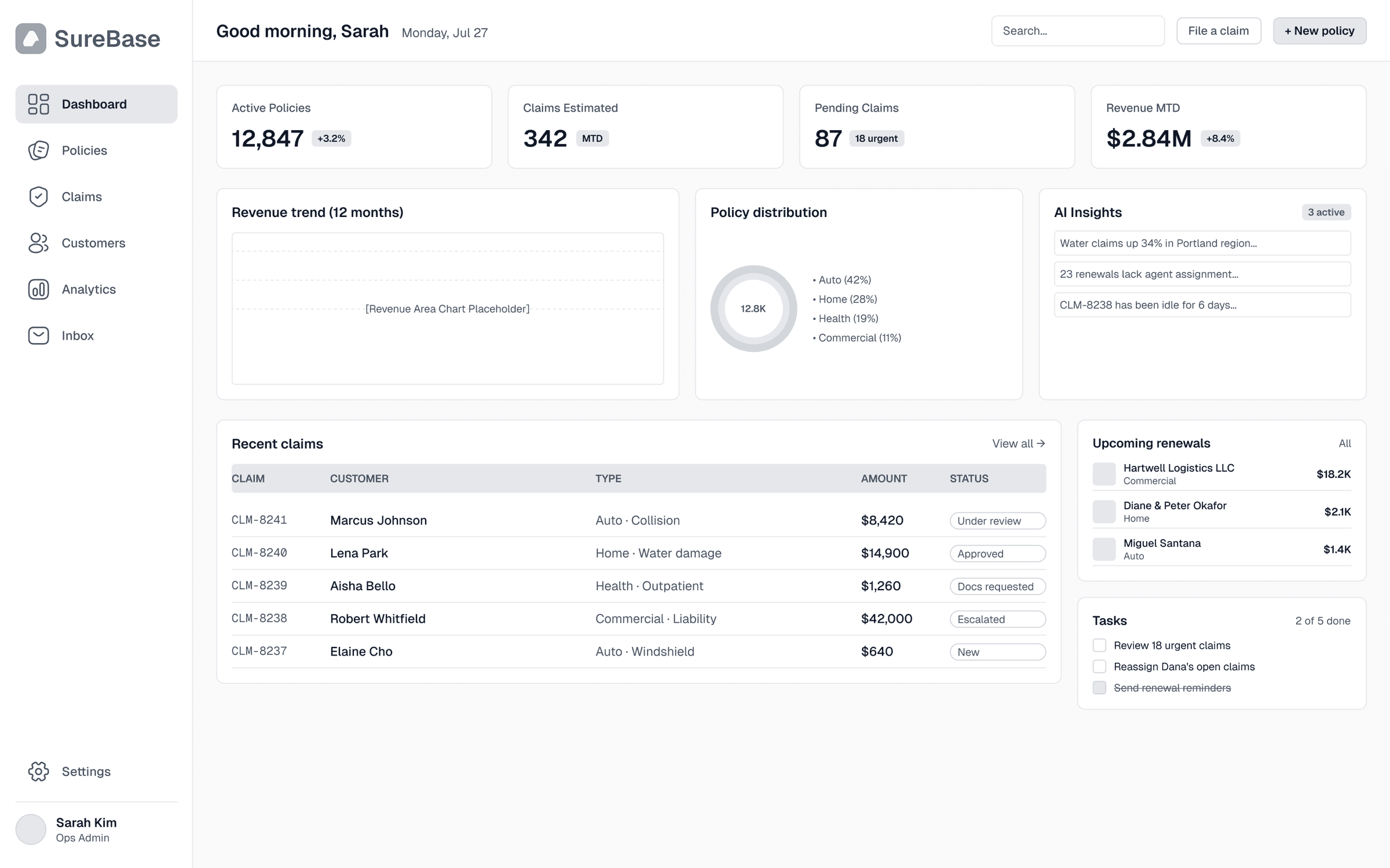
I mapped the core workflows around policy management, claims processing, and customer lookup, then structured the interface around those tasks. The challenge was balancing high data density with a visual hierarchy that made information quick to scan and actions easy to find.
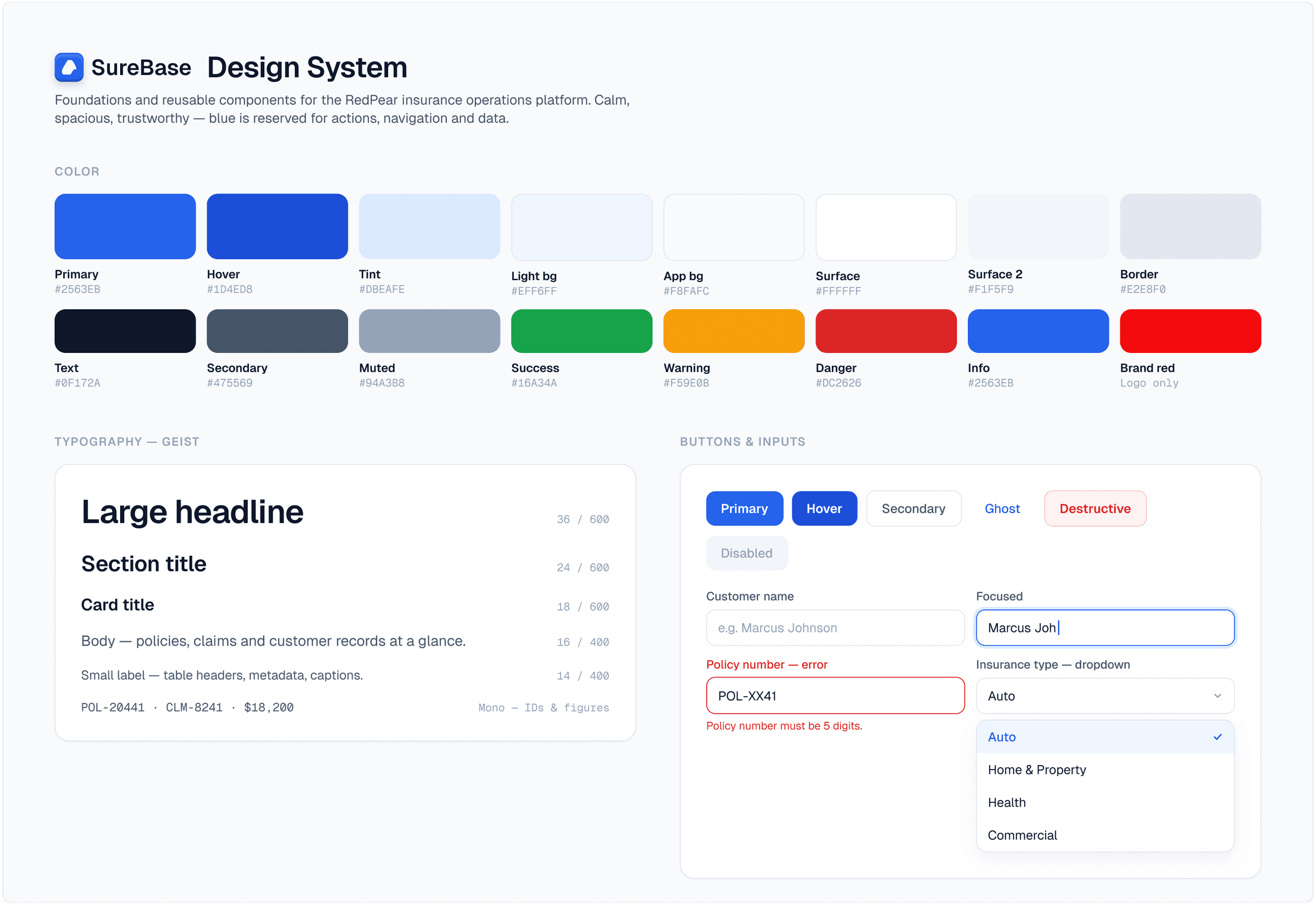
One system, multiple workflows.
I built a reusable component system to keep the experience consistent across the dashboard. Policies, claims, customer profiles, analytics, notifications, and responsive layouts were designed as parts of the same system rather than isolated screens.
A clearer way to manage insurance operations.
The final dashboard brings the core workflows into one structured interface, with clear data hierarchy, status indicators, responsive layouts, and interaction patterns designed for frequent administrative use. Accessibility was also considered through typographic hierarchy, contrast, recognizable components, and distinct interactive states.
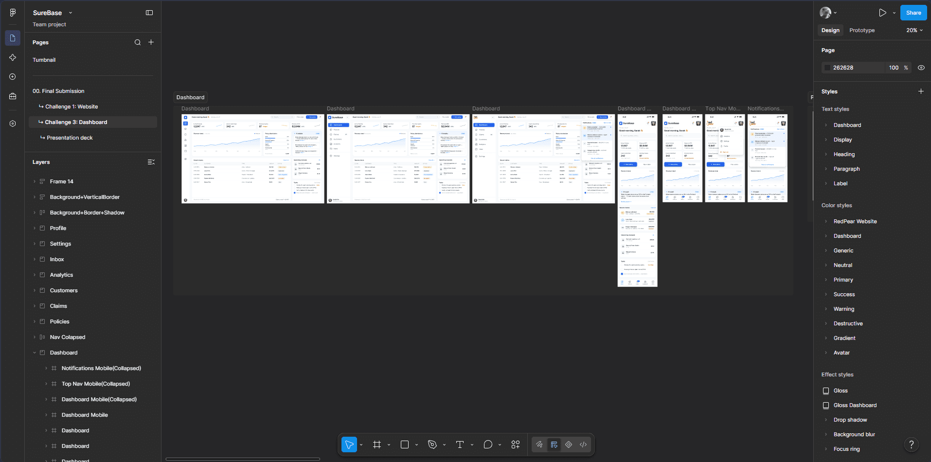
From Figma to a working product.
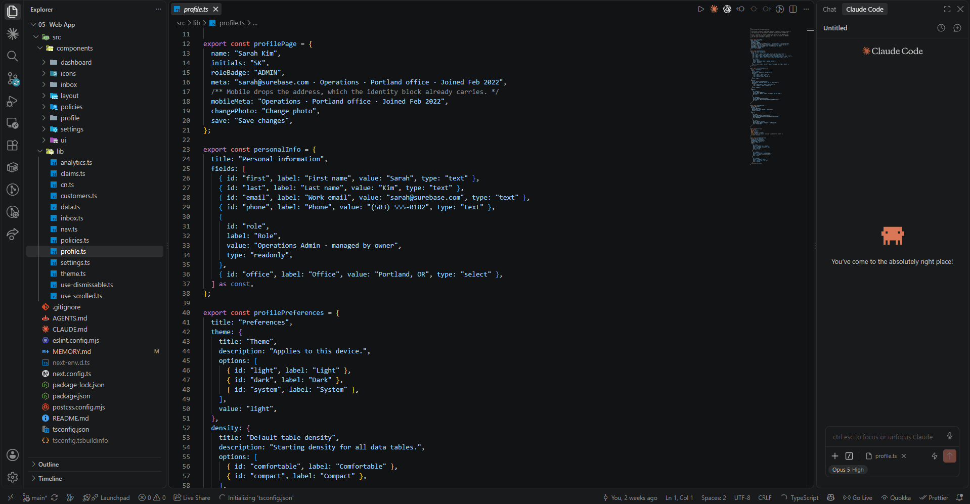
I took the dashboard beyond the design stage and built the experience as a functional responsive web application. The implementation followed the component system established in Figma, keeping the interface consistent across policies, claims, customers, analytics, and responsive states.
Complex systems need simple interfaces.
Surebase pushed me to think beyond individual screens and design the underlying system that makes an enterprise product feel consistent, scalable, and easy to use. The result was less about making an insurance dashboard look modern and more about making it work clearly at scale.
More projects worth exploring.
A selection of other projects across web design, product design, and development.